Simple solution for image slider
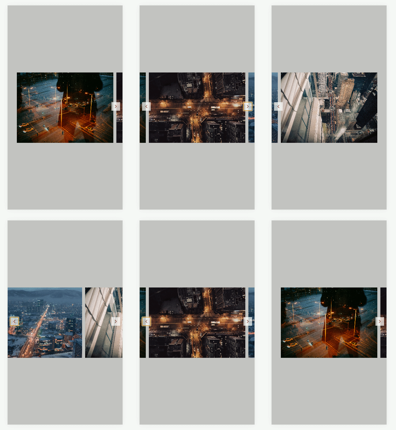
In this tutorial, I am going to show you how to build an image slider which is simple and doesn't require much coding but powerful enough for your website. Here is what we are building:

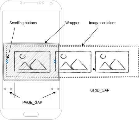
We will need two div tags: one will be an image container to place all images horizontally; another will be a container wrapper to hold the image container and left/right scrolling buttons. Everytime, users click on left/right scrolling buttons, we instruct the image container to scroll to the left/right one image length while performing a little animation to make it look like a slider. The picture below will help you to visualize how all components attach together.

The wrapper is just there to hold scrolling buttons, because if we put those buttons inside the image container, when the image container scrolls, those buttons will move.
const Wrapper = styled.div`
  box-sizing: border-box;
  width: 100%;
  position: relative; // two scrolling buttons will be positioned to the wrapper
`;
Two scrolling buttons need to be positioned accordingly to the left and right of the wrapper
const LeftScrollButton = styled.button<{ hide?: boolean }>`
  position: absolute;
  left: 8px;
  top: calc(50% - 14px); // center vertically

  transform: rotate(180deg);
`;
const RightScrollButton = styled.button<{ hide?: boolean }>`
  position: absolute;
  left: 8px;
  top: calc(50% - 14px); // center vertically
`;
For the image container, I am using a css grid to hold images, but you are free to use other css too, like css flex or table. The idea is to hold all images horizontally. Also, I insert two pseudo-elements, before and after, to leave spacings at the start and end of the image slider, so that when users scroll to start or end images will align the page gap.
const ImageContainer = styled.div`
  display: grid; // hold images horizontally
  grid-auto-flow: column;
  gap: ${GRID_GAP}px;

  overflow: hidden; // hide browser's scroll bar

  // Add padding to the grid container to show gap when scrolling to edges
  &:before,
  &:after {
    content: '';
    display: block;
    width: ${PAGE_GAP - GRID_GAP}px; // assume page gap is larger than grid gap
  }
`;
In order to show one image at a time, we need to set the image's width equal to viewport’s width subtract by two page gaps (left and right) and control the scrolling by subtracting or adding to the image container's scroll position by one image's width based on scrolling direction. In short, we are telling the image container that you need to scroll to left/right just one image and remember to do it slow by using option “behavior: smooth”
const Image = styled.img`
  width: calc(100vw - ${PAGE_GAP * 2}px); // image's width = viewport's width - left page's gap - right page's gap
  height: 230px;

  object-fit: cover; // make image content fill all image’s frame
`;

const handleLeftScrolling = () => {
    imageContainer.scrollTo({ top: 0, left: imageContainer.scrollLeft - imageWidth, behavior: 'smooth' });
}
const handleRightScrolling = () => {
    imageContainer.scrollTo({ top: 0, left: imageContainer.scrollLeft + imageWidth, behavior: 'smooth' });
}
When users scroll to start or end, we also need to hide scrolling buttons to tell users that they are at the edges. We can determine that by looking at the image container scrolling position, if it is 0, users are at the left edge, if it is equal to image container client width, users are at the right edge.
Finally, as you see, we don’t use any complex html structure or fancy css animation, but by putting all the above things together we will have a nice image slider that is cool enough for our websites. I think, the critical thing here is the scroll behavior smoothly which make it looks like a slider than a scrollbar and luckily that behavior are supporting in major of modern browsers. So, why bother? Enjoy it. You can check out the whole source code from this Github repository.